Colour is a crucial component of interior design that has a profound effect on our emotions, moods, and general well-being. Interior designers can create aesthetically pleasing and compelling spaces by utilising colour psychology.
Transforming Spaces With Colour Psychology
Colour psychology investigates the impact that various colours have on our subconscious. This article will explore the intriguing field of colour psychology and demonstrate how it may be used to radically alter spaces.
See also: HOSPITALITY INTERIOR DESIGN: CREATING MEMORABLE GUEST

What Is Colour Psychology & How It Works
1. Understanding Colour Psychology
Colour psychology is the study of how colours influence perceptions, emotions, and behaviour in people. Every colour has special psychological qualities that can cause certain emotions and behaviours. Here are some hues that are frequently utilised in home design and their corresponding psychological impacts:
Calming Blues

The colour blue is thought to encourage calmness, relaxation, and tranquillity. To establish a tranquil and calming ambiance, it is frequently utilised in baths and bedrooms.
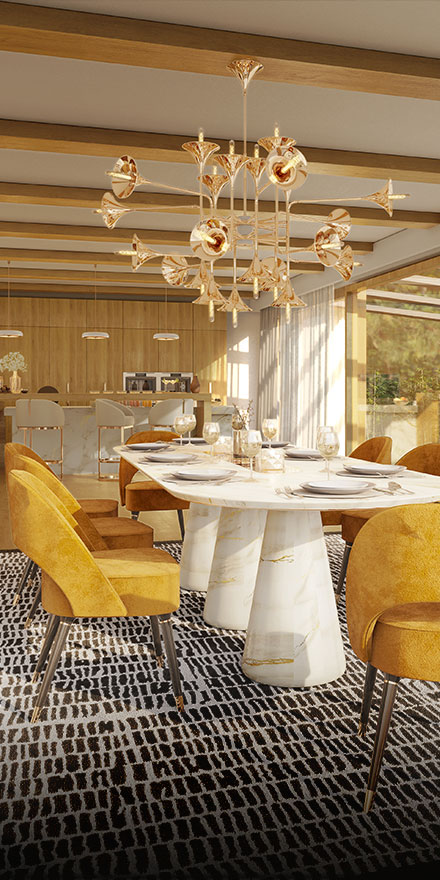
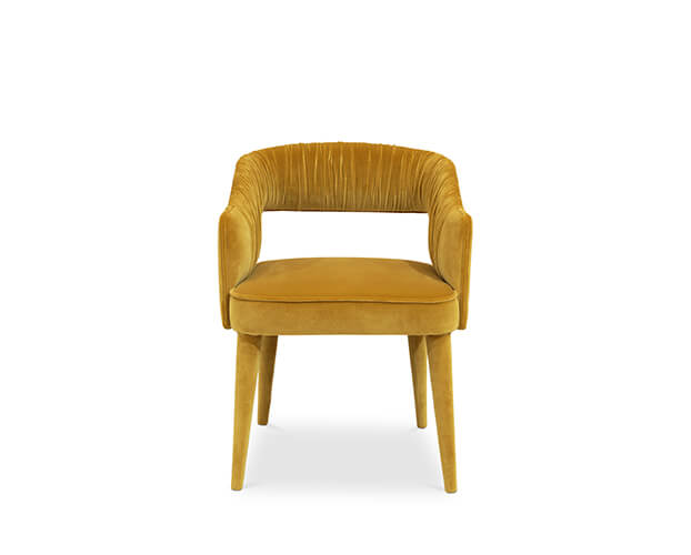
Energizing Yellows

Yellow is a colour that represents joy, optimism, and inventiveness. It can infuse a room with life and warmth, making it perfect for kitchens, home offices, or places where people connect with one another.
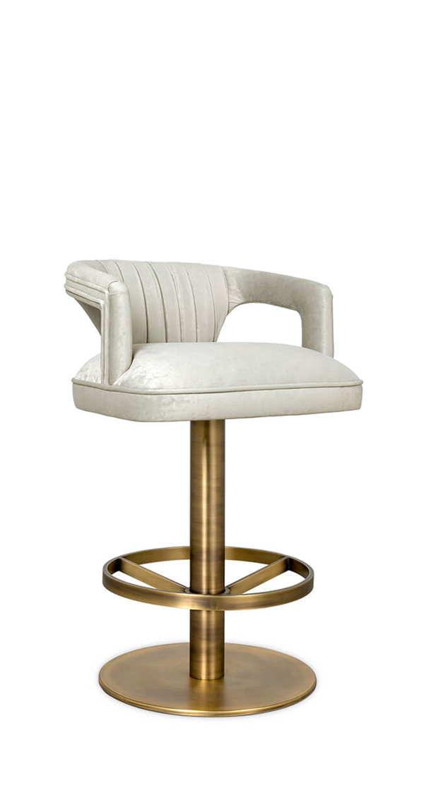
Get The Look

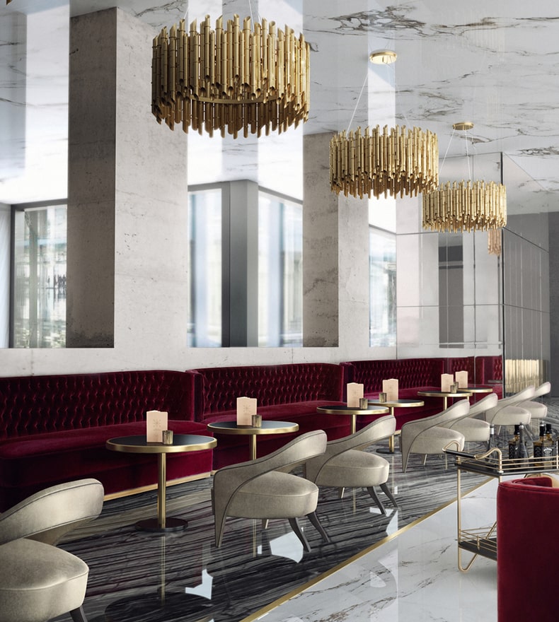
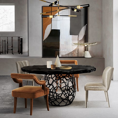
Passionate Reds

Red is a strong, brash colour that inspires passion, vigour, and excitement. It can be carefully placed to encourage conversation and foster a dynamic atmosphere in areas like dining rooms or living rooms.
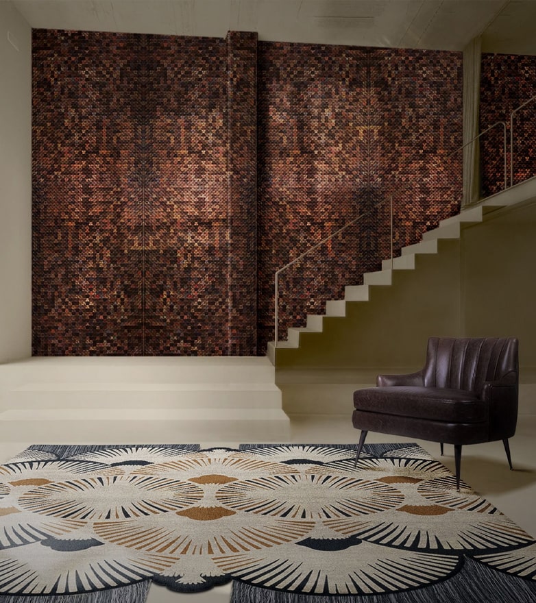
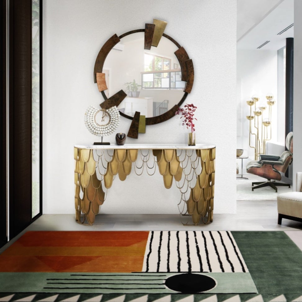
Grounding Neutrals

Beige, grey, and white are examples of neutrals that offer a flexible base for interior design. They engender a sense of harmony, refinement, and timelessness. Additionally, neutrals provide a background for a variety of design styles and allow other colours to stand out.

2. Creating Harmonious Spaces
It’s crucial to comprehend how colours affect our emotions in order to design aesthetically pleasing places that serve each room’s intended function. The following advice will help you use colour psychology in interior design:
Balance Warm and Cool Tones

Cool colours like blue, green, and purple provide a sense of tranquillity, while warm colours like red, orange, and yellow can create a cosy and inviting ambiance. To make a room look visually pleasing, blend warm and cold tones together.
Consider Room Function

Start by thinking about the space’s function and the desired emotional response. For instance, soothing blues or muted greens in the bedroom might encourage rest, while vibrant hues like orange or red can inspire motivation in the home gym.
Get The Look

Experiment with Accent Colours

To create focus areas and enhance visual interest, use accent colours. For instance, a neutral-coloured space might come to life with an unexpected flash of bright yellow or a pop of lively red. Statement furniture items, works of art, or accessories can all be used to incorporate accent colours.
Consider Cultural Associations

Colours can have a variety of cultural associations and meanings. When choosing colours, take into account the intended occupiers’ cultural background. White, for instance, conjures up purity in Western societies but sadness in some Asian ones.


3. The Power of Colour Combinations
In interior design, combining colours can result in a vibrant and interesting environment. Here are some well-liked colour schemes and their corresponding psychological effects:
Complementary Colours

On the colour wheel, complementary colours are those that are directly opposite one another, such as blue and orange or red and green. These combinations give a space a lively and aesthetically arresting appearance while also bringing contrast and vitality.
Monochromatic Colours

Utilising many hues and shades of one colour constitutes a monochromatic colour scheme. As a result, a unified and refined appearance is produced, which is perfect for areas where a serene and sophisticated atmosphere is desired.
Analogous Colours

Utilising colours that are close to one another on the colour wheel, such as blues and greens, is known as an analogous colour scheme. Harmony and tranquilly are produced by this combo.

In interior design, colour psychology is a potent tool that enables us to modify rooms and incite desired feelings and moods. We can design aesthetically pleasing and interesting spaces that serve the unique requirements of each space by understanding the psychological impacts of colour. The appropriate colour schemes may have a big impact on our mood and experience in a space, whether they are peaceful blues in a bedroom, energising yellows in a home office, or passionate reds in a living area.
It is essential to take the function of the space into account, balance warm and cool tones, experiment with accent colours, and be aware of cultural connotations when implementing colour psychology into interior design. We may design vibrant, aesthetically beautiful rooms that improve our daily lives by carefully choosing and blending colours.


Keep in mind that colour psychology is a potent instrument for communicating emotions, affecting our mood, and influencing how we perceive space in addition to being a visual feature. It can arouse feelings of happiness, calm, excitement, or tranquilly. Consider the psychological effects of colours and embrace their transformational power when starting your next interior design project.
Unleash the power of colour psychology in your interior design endeavours, and see how a thoughtful colour scheme can breathe new life into your home while also producing an appealing, aesthetically pleasing, and custom-made atmosphere for your requirements.
See also: THE BEST INTERIOR DESIGN BLOGS TO GET YOU INSPIRED
What did you think about this article on colour psychology? Stay updated with the best news about trends, interior design trends, and furniture high-end brands, sign up for our Newsletter and receive it in your email – free of charge, the latest and the most exclusive content from BRABBU Blog. Follow us on Pinterest, Instagram, Facebook and Linkedin!


.png)