We have seen pastels popping up in fashion and interiors in a big way over the last five years. Different shades of colors always flow in and out of home decor trends, BUT one that has particular staying power in Chicago Color Interior Design Trends is Powder Blue.

Some might consider this chalky hue a safe alternative to all the grey out there and really respond to powder blue when it’s the statement color in the room!

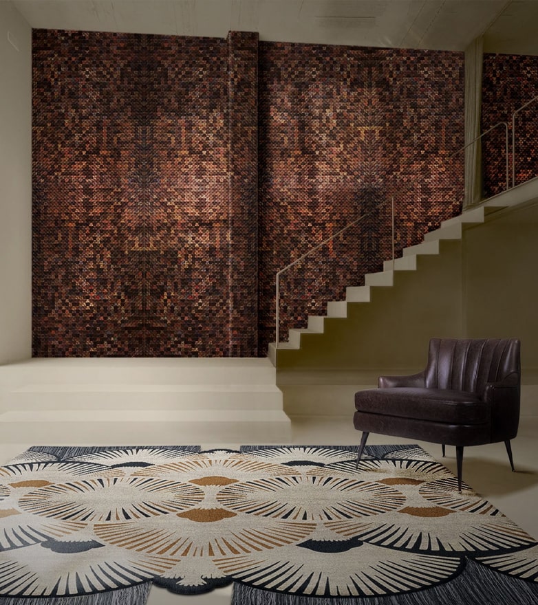
Designer: Isabel Lopez Quesada, Source: AD
Here’s more on decorating with powder blue.

Source: Pinterest, designer unknown
It’s a bold and (often) beautiful move to paint a ceiling or moldings in a color other than white, but as you can see, powder blue can really work in many different settings. We naturally respond to a blue ceiling because the sky is blue, and taking the saturation down to a powdery blue hue adds an element of sophistication.

Source: Casa Decor 2018
Chicago interior designers are willing to go for painted molding or millwork! They consider where it will start and stop and how it mixes in with traditional white molding. You can see both the powder blue door frame and the white crown molding in this shot, and it looks so good together! When considering a light blue paint color always go more grey than you think to avoid it looking too baby blue. Really good soft blues have some black in them to temper the intensity, and Chicago interior designers also like when they go slightly blue-green as well!
A few of Chicago’s interior designers very favorite soft blue hues are:
Palace Pearl

Light Blue

Light Blue Farrow and Ball
Borrowed Light

Borrowed Light Farrow and Ball
There have been lots of navy blue kitchens in the past few years in Chicago but it’s exciting to see powder blue popping up in kitchen cabinets, stoves, hoods and tile as a brighter alternative. The soft color really shines in a kitchen setting when combined with marble, wood and metal.

Source: Lacanche US

Source: Lacanche US

Source: Addison’s Wonderland blog/Instagram.
We hope some of these images encourage you to consider decorating with powder blue as a statement such as Chicago Color Interior Designs!
DON’T FORGET TO READ
Simple to Extravagant – Celeste Jackson Interior Designs
Inspirational Interiors from Foster Hill Design
If you want to be up to date with the best news about trends, interior design tips, and furniture luxury brands, you must sign up our Newsletter and receive it in your email – free of charges, the latest and the most exclusive content from Inspiration and Ideas.


.png)