Pantone Colour of the Year 2022 is going to be today’s topic. Announced a few days ago, Pantone’s colour choice for next year is a mix between blues and violets, encouraging personal inventiveness and creativity. Pantone has been the worldwide giant for colour communication and inspiration since 1963, being the guiding choice for fashion, interior design, trends, and much more.
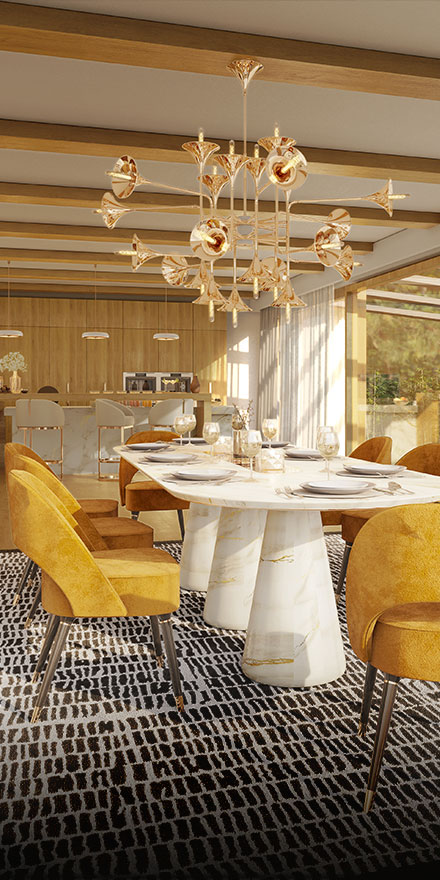
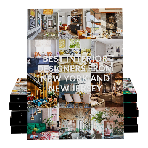
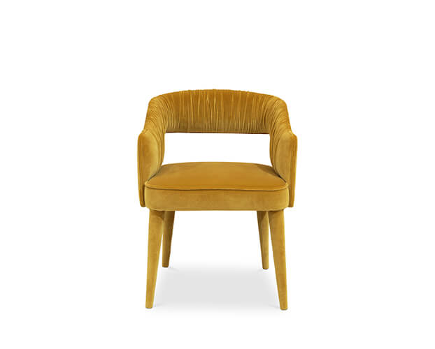
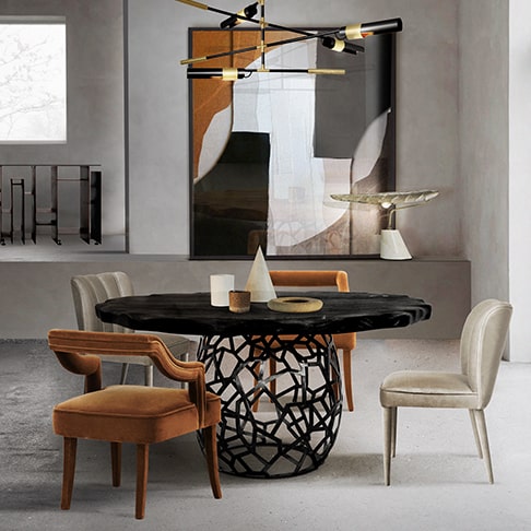
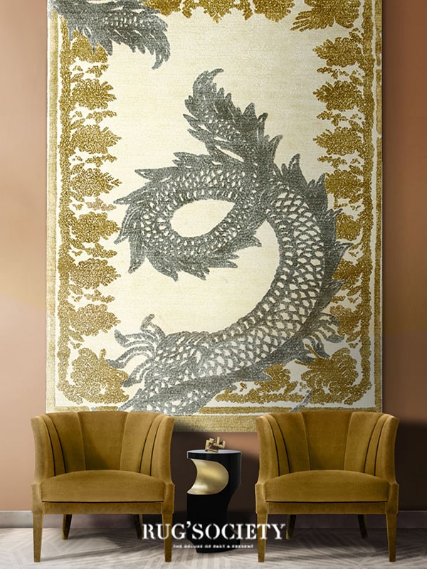
See Also: Modern Dining Room: Rectangular Dining Tables & Velvet Dining Chairs
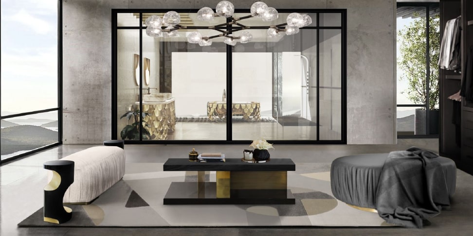
Pantone 2022 Colour of the Year: Very Peri

With a carefree and confident display and a daring curiosity that animates our creative sprite, the Pantone 17-3938 Very Peri is inquisitive and intriguing, helping us embrace landscapes of possibilities, opening us up to a new vision as we rewrite our lives. Pantone 17-3938 rekindles gratitude for some of the virtues that blue represents, complemented by a new perspective that rings true today. Very Peri casts a new light on the future.
We are living in a period of transition. Very Peri (PANTONE 17-3938) is a representation of the current global zeitgeist and the transformation we are seeing. Our conceptions and norms are shifting as we emerge from a period of profound seclusion, and our physical and digital lives have fused in new ways. Digital design allows us to push the boundaries of reality by allowing us to enter a dynamic virtual environment where we may experiment with and develop new colour combinations. PANTONE 17-3938 Very Peri highlights the merging of modern life and how colour trends in the digital world are manifesting in the physical world and vice versa, thanks to gaming patterns, the growing popularity of the metaverse, and the growing artistic community in the digital environment.


“The Pantone Color of the Year reflects what is taking place in our global culture, expressing what people are looking for that colour can hope to answer,” added Laurie Pressman, Vice President of the Pantone Color Institute. “Creating a new colour for the first time in the history of our Pantone Color of the Year educational colour program reflects the global innovation and transformation taking place. As society continues to recognize colour as a critical form of communication, and a way to express and affect ideas and emotions and engage and connect, the complexity of this new red-violet infused blue hue highlights the expansive possibilities that lay before us”.
PANTONE 17-3938 Very Peri has a sprightly, happy attitude and dynamic presence that stimulates brave creativity and inventive expression. It embodies the traits of the blues while also having a violet-red undertone.
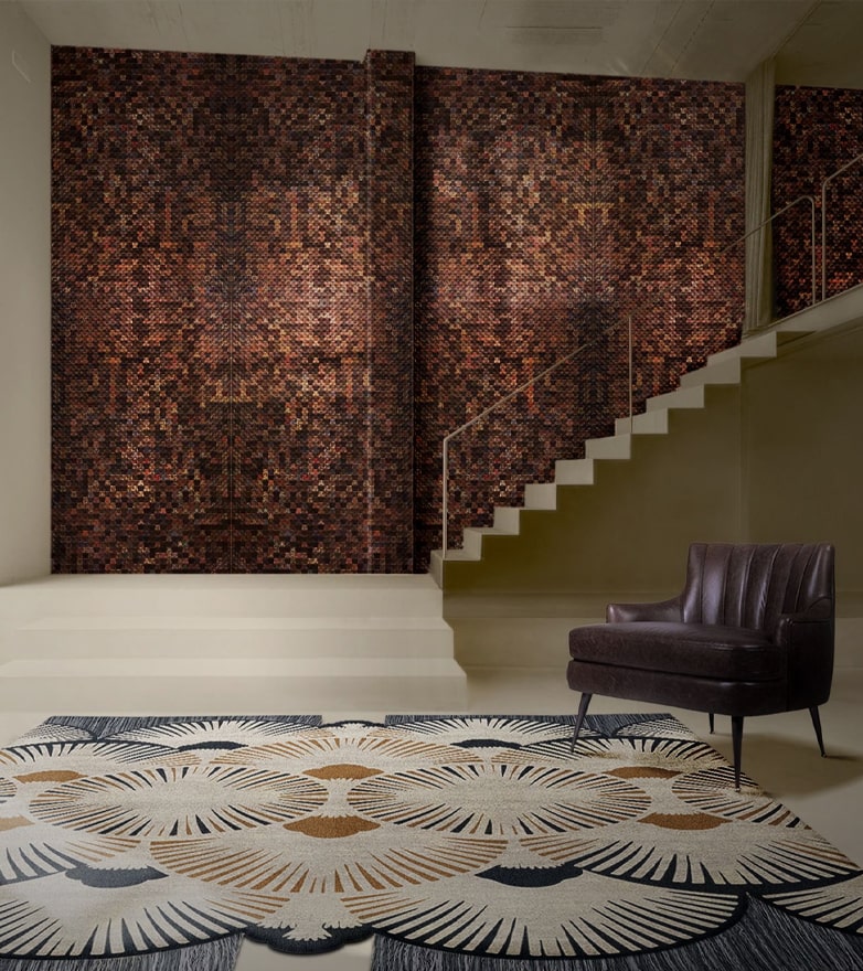
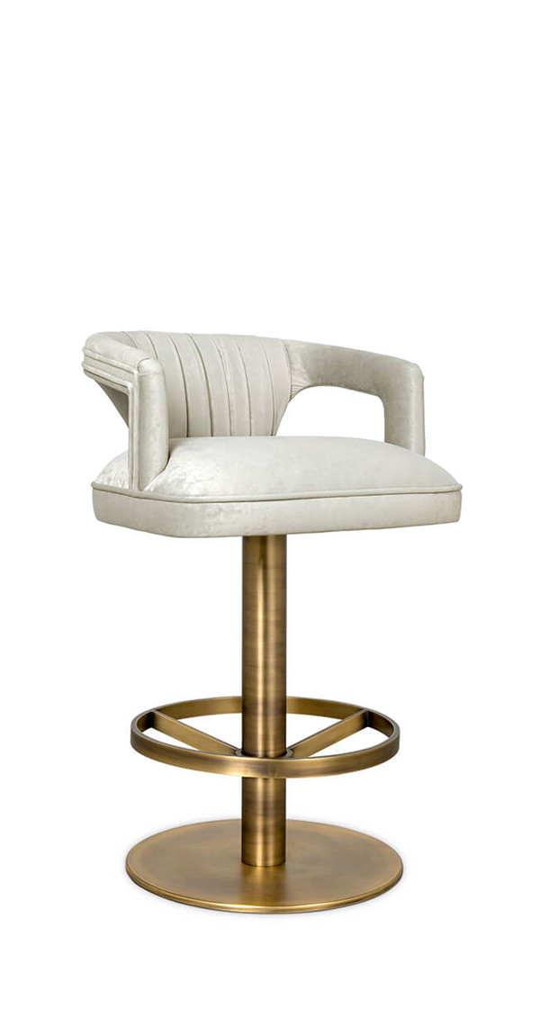
See Also: Open Space Modern Living Room Decor for a Trendy Design

What did you think about this article on Pantone 2022 Colour of the Year: Very Peri and Your Modern Home Decor? Stay updated with the best news about trends, interior design tips, and furniture luxury brands, sign up for our Newsletter and receive it in your email – free of charge, the latest and the most exclusive content from Inspiration and Ideas. Follow us on Pinterest, Instagram, Facebook and Linkedin!


.png)